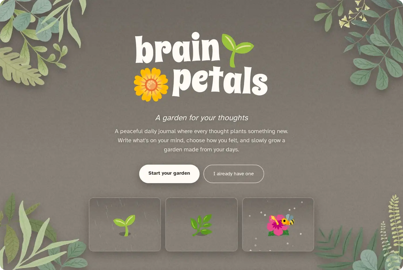
The landing page. The three little windows under the buttons are live canvases, not pictures. They run the same weather and light code the app does.
Case study // Personal project, no NDA, all mine
A garden for your thoughts. Write a line about your day, choose how you felt, and every entry plants a flower in a private garden only you can see. The mood you pick decides which flowers are available, so a year of entries isn't a garden decorated with feelings. It's a garden made of them.
The landing page. The three little windows under the buttons are live canvases, not pictures. They run the same weather and light code the app does.
BrainPetals started as something else. It was a goal tracker: name a goal, and every task you finished planted a flower toward it.
Then I asked what happens when someone finishes.
A goal ends. “Find a new job” completes, the garden is done, and it is never opened again. Every successful user leaves, and the better the product works, the faster they go. I had designed a thing that fires its own customers.
A diary has no completion state. There is no version of “I finished having days.” Same renderer, same art, same one-flower-per-entry mechanic, but now the cadence is daily instead of sporadic, and the garden is never finished because the year isn't.
I lost nothing in the pivot. The watercolour corners, the drifting light, the wandering bee, the rule that nothing dies: none of that was ever productivity art. It had been a calm aesthetic wearing a to-do list, and taking the to-do list off made it honest.
A diary has no completion state.
This is the one mechanic everything else protects.
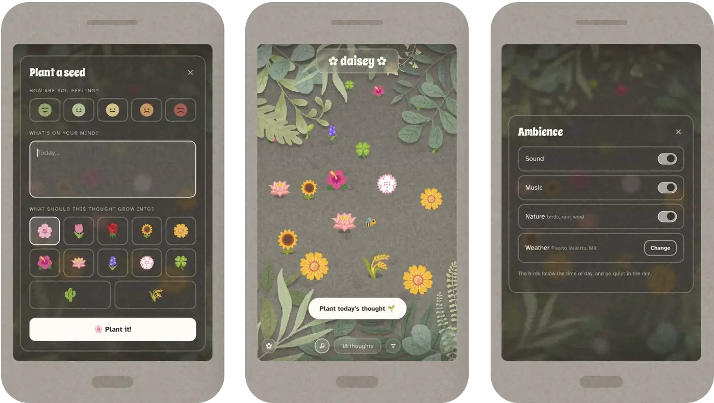
You choose a mood. The mood decides which flowers are available, and you pick from those. You never choose freely from all twelve.
That single constraint is what makes the garden mean something. A year of entries isn't a garden decorated with feelings, it's a garden made of them. Look at it in December and the shape of the year is right there, in colour and species, without a single axis or average.
It's also my escape route from charts. Mood tracking drags every app toward graphs: weekly averages, trend lines, a number for how you're doing. That is exactly the feeling I was trying to get away from. Making the garden itself the visualisation means there is nothing to graph.
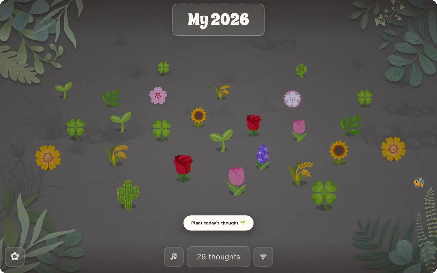
Two rules fell out of that, and both matter more than they look.
The garden is the visualisation.
Here is the version of that screen I nearly shipped.
Opening the sheet put the cursor in the writing box. On a laptop that's a courtesy. On an iPhone it summons the keyboard, which takes half the screen, so the moods are pushed off the top, the flowers are pushed off the bottom, and the only thing you can do is the one thing the sheet doesn't ask for first.
The fix is one line, and the reasoning is the whole point: focus is now guarded by (pointer: fine), which asks about the primary pointer. A mouse gets the cursor dropped in the box. A touchscreen laptop does too. A phone doesn't, and the keyboard arrives when it's actually asked for, which is when you tap the box.
Then I took away the words. The mood labels and the flower names were the tallest things on the sheet; “Cherry blossom” wrapping to two lines set the height of every row in the grid. Removing them was worth 130 pixels, which is the difference between scrolling and not.
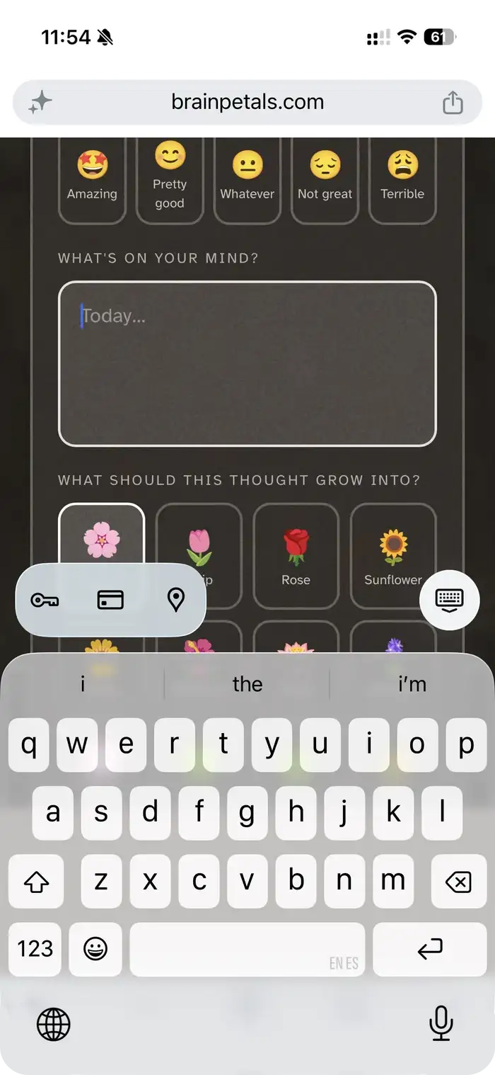
Tap “plant a thought”, and this is what you get. The keyboard takes half the screen and leaves you nothing the sheet actually asks for first.
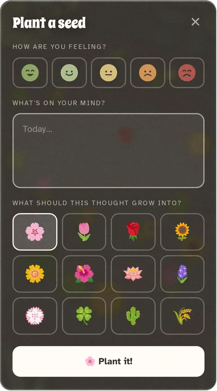
Three decisions, two of them taps. Everything fits one phone screen with nothing to scroll.
The moods used to be emoji, 🤩 😊 😐 😔 😩, with the name printed underneath. Five yellow discs that said nothing a glance could use.
I sketched what I wanted instead: a green-to-red scale, flat, no words. Then came the part I didn't expect to care about.

The palette came off the artwork, not off my reference image. My reference was a stock set of flat faces in saturated primaries. Dropped into the app they looked borrowed. So the greens were sampled out of the corner paintings, the yellow out of the wheat, the orange out of the marigold, and the red out of a rose that was already in the garden. The features are the same warm near-black the buttons use, never the navy from the reference, because there is no cold neutral anywhere else in this interface.
The eyes were wrong and I could only say it as “too close together.” They were. The arc eyes on the first and last face were centred 9 units apart while the dot eyes on the middle three were 10.8, so those two faces genuinely were narrower. All five share the same centres now, with the arcs drawn slightly wider, because an arc reads as narrower than a dot at identical spacing.

One quiet decision inside this: the faces are keyed to a mood's position in the list, not to its name. Moods live in the database precisely so they can be reworded or reordered without touching the app, and hard-coding “amazing = green” would have broken that promise silently.
Flowers kept getting lost in the corners, tucked under the painted leaves.
The plot was a rectangle inset from the screen edges. I asked for an oval instead. The corners are the one part of a rectangle this frame can't use, so stop offering them.
The oval alone didn't fix it, and the reason is the good part. The corner art is a square image; the code that kept flowers clear of it reserved a circle. On a phone the two top paintings are large enough to overlap across the middle of the screen, so a flower could sit outside both circles and still be comfortably under a leaf.
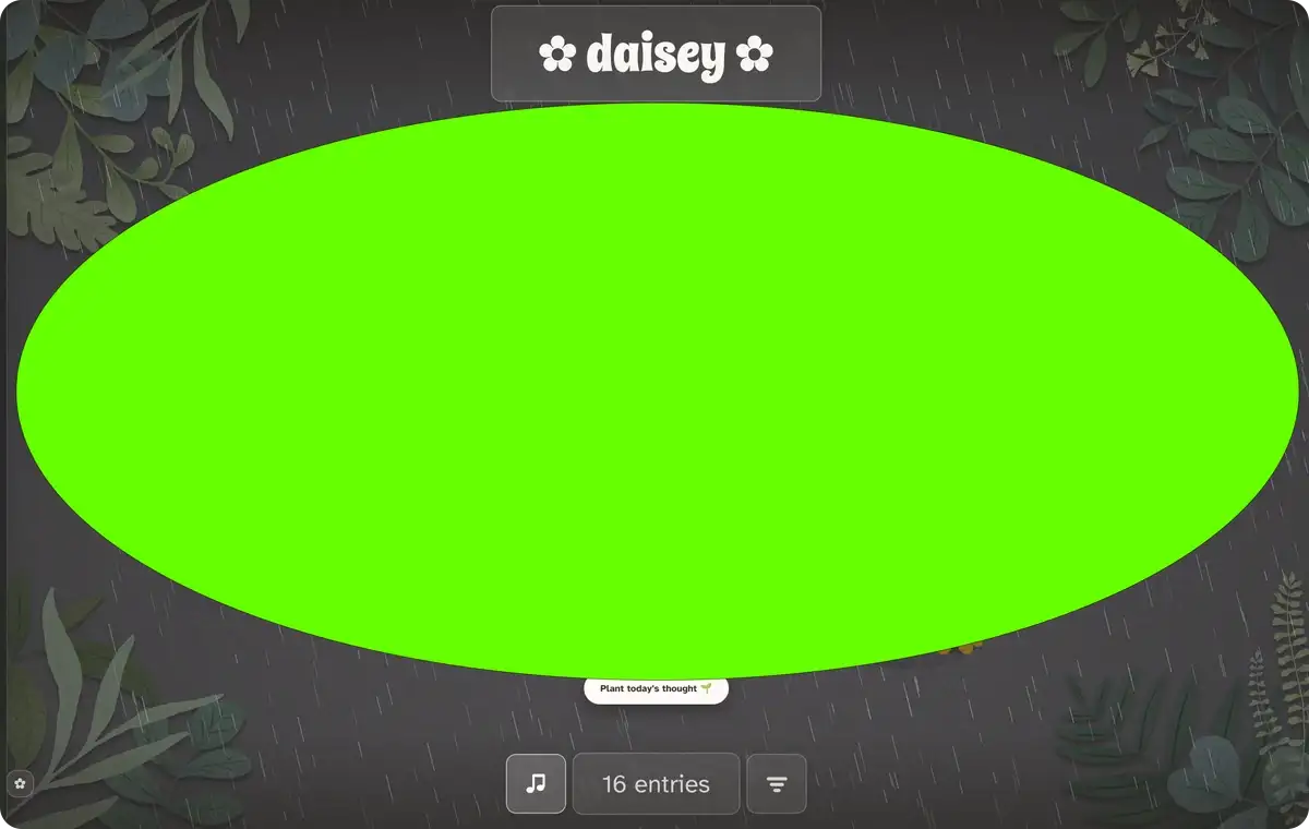
A round reserve for square artwork is a check that passes while the thing it guards is wrong.
I also made myself measure the cost rather than assume it. My first note claimed the oval made the garden bigger. It doesn't:
| Before | After | |
|---|---|---|
| Plantable area, 1440×900 | 519,000 px² | 449,000 px² |
| Plantable area, 390×844 | 137,000 px² | 119,000 px² |
About 13% smaller, both ways. Widening the plot from 72% to 94% of the screen nearly pays for the ellipse. What it doesn't pay for is the bigger square corner reserve. That's a fair price for never planting a flower somewhere it can't be seen, but it is a price, and the comment in the file now says so, and names the two numbers that buy it back.
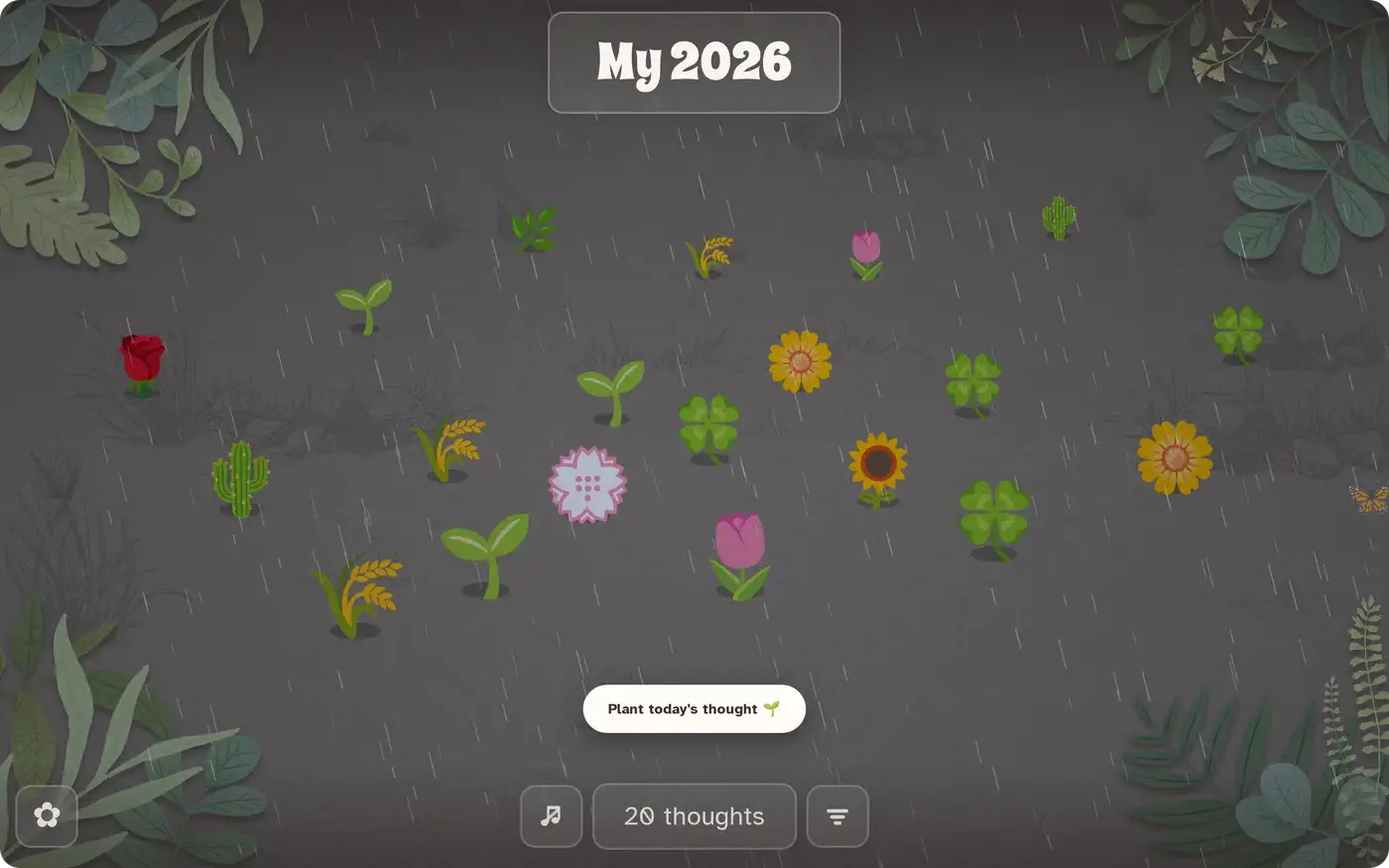
The garden has weather and a time of day, and both are real.
Light runs on a nine-keyframe day interpolated continuously against your actual clock, so opening it at lunchtime and opening it at dusk are different experiences without the app ever announcing that.

Rain and snow are optional and can follow your real forecast. Location is asked for late, rounded to one decimal place, and stored only on your device. It never reaches the database, so there is no row anywhere tying a person to a place.
The music is synthesised rather than sampled: a four-chord turn in A minor with the voicing, timing and duration chosen fresh each pass, so it never loops. Birdsong follows the hour and goes quiet in the rain, because birds asleep is the correct amount of birdsong at 2am.
That last part had a bug I'm still fond of. I reported that I couldn't hear the music at all. Every flag said it was working: audio context running, oscillators scheduled, gain non-zero. Tapping a meter onto the output found it. Essentially all of the energy sat below 180 Hz, where laptop and phone speakers simply do not reproduce. It was playing perfectly into a range nobody's hardware could make a sound in.
The balance between the pad and the birds was fixed the same way, in bands rather than by ear: the pad used to sit 16 dB above the birds and now sits 7.
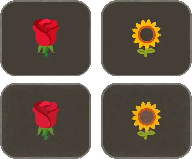
There's a single sheet of noise over the entire interface: canvas, glass, panels, the modal veil. It's a habit from my visual art, and here it does a specific job. The scene is assembled from four unrelated rendering paths, painted corner art, a colour font, live canvas and backdrop-filtered CSS, and one texture running across all of them is what makes them read as one surface instead of four layers.
Twice I said something looked like it was sitting on top of the grain rather than under it. Twice I was wrong about the cause, and it's the same wrong both times.
The grain blends with overlay, which by definition cannot move the ends of the range. White stays white; saturated colour barely shifts. So the mid-tone ground took the texture beautifully and the bright things sitting on it, a monarch butterfly, a sheet full of flower glyphs, took almost none.
The fix isn't a layer change. It's a filter that makes its own speckle, clips it to the artwork's own alpha so none lands on the air around it, and lays it on at normal blend, which bites at every brightness.
“It looks like it's on the wrong layer” is a symptom, not a diagnosis.
This is the most personal text a person will ever type into anything I make, so the privacy position had to exist before one friend wrote one real entry.
The honest starting point: you cannot cryptographically stop a database superuser from reading a column the server also has to read. Any product that tells you otherwise about a searchable diary is choosing words carefully. So instead of pretending, I closed the part that genuinely could be closed and made the rest leave a receipt.
The whole thing is asserted in an executable test that runs after any policy change, because a defence you never tested against the failure it defends against isn't a defence. That test caught a real one: revoke select (body) ran cleanly, read like a fix, and changed nothing. A column-level revoke cannot take away a table-level grant.
There are no analytics anywhere in the product. Not in the app, not on the landing page. That one nearly went the other way: a tag went in, the privacy policy was rewritten around it, and then the whole thing was walked back, because a site that hadn't launched would have traded a plain promise for numbers about nobody. The build now fails if an analytics loader appears in any shipped file, so adding one later has to be a decision, and whoever makes it walks past three sections of the privacy policy on the way.
A flower opens 24 hours after you plant it, and you get an email at that moment. It names the day, the flower and the garden. It used to name the mood too, and I took that out.
If yesterday was a bad day, you probably don't want a reminder of it landing at breakfast. It's fine to see the flower. Seeing an angry little face might put you straight back in it. Inside the app the mood sits beside every entry, because opening your own diary is choosing to look. A notification arrives uninvited, and the person didn't pick that moment.
The mood is still handed to the email builder and simply not used. There's a test that proves it, run against a fixture that deliberately does carry one, so if it's ever wired back in by accident the build goes red.
The email also never contains a word of the diary, and that's structural rather than careful: the function that fetches what to send has no text column in its return type, and the key it runs under was revoked from that column anyway. It fires because a flower bloomed, never because one didn't. No streaks, no missed-day nudges, and there's a check that scans the copy for the vocabulary of nagging.
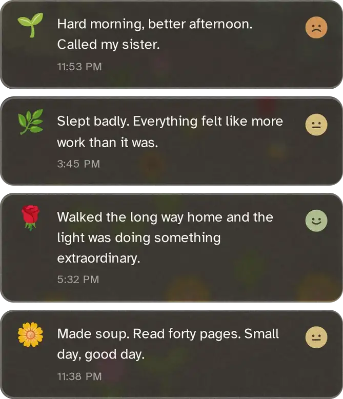
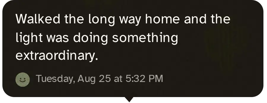
The diary is a list, not a chart. Each row is the flower on the left, what you wrote and when in the middle, and how you felt on the right.
No flower name, no mood name. Naming either would be the same thing said twice, since both are already sitting there as pictures.
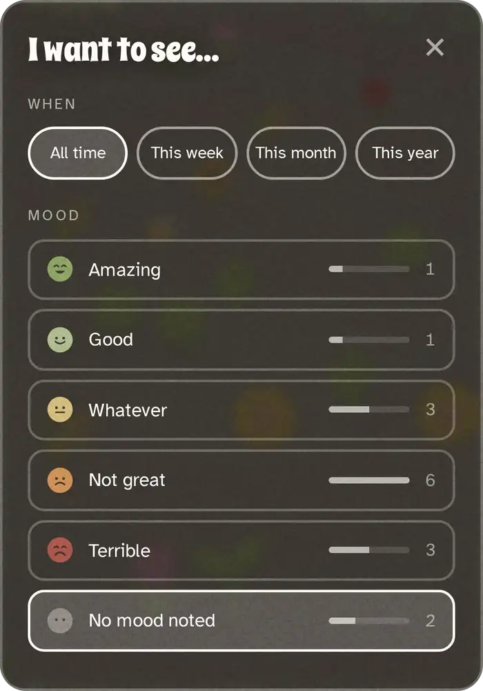
The grey face at the bottom of the filter panel is “no mood noted.” It has eyes and deliberately no mouth, because a straight line would read as “whatever”, which is a feeling somebody chose.
It's painted in the middle of the scale and then greyed by the same filter an unchosen face wears, rather than a grey I picked out of a screenshot, so it can't drift out of step later.
The pattern I trust most in this project: when something looks wrong, get a number before changing anything. It was right more often than my eye was, and twice it told me the thing I was about to fix wasn't broken.
There are 220 automated checks now, run headless against a real browser. They assert computed styles rather than the stylesheet, measure the live element rather than a number typed into the test, and derive expected values from the database rather than repeating its copy, because a test that asserts wording will fail on wording and tell you nothing about the thing it was guarding.
Solo, with Claude, over about a week, sitting on top of a renderer I'd already built for a previous project.
What I actually did all week was decide things. What happens when someone finishes. Whether a bad day should look worse on screen. Whether an email should mention it. Whether “pretty good” fits on one line. Whether a metric is worth an analytics script on a page that displays somebody's diary.
The assistant was fast at the parts I could describe precisely and genuinely useful at the parts I could only describe badly. “The eyes are too close together” turned into a measurement I could check. It was also confidently wrong in writing at least once, in a code comment claiming the oval made the garden bigger, which is exactly why the numbers above got taken rather than trusted.
The tools changed. Knowing what to ask didn't.
Key takeaways
“Is this good” and “what happens to someone this works for” have different answers, and the second one is the product.
The shape of your safeguard has to match the shape of the danger.
Half of what looked like a rendering bug was a blend mode, a containing block, or a test that had drifted, and the measurement said so in about a minute.
No charts. No streaks. No analytics. No mood in the notification. Somebody will sensibly propose adding every one of those later, including me, and a comment that says why is the only thing that survives the six months in between.
Where it landed
Live at brainpetals.com, deployed on every push. The whole app is one HTML file with no framework and no build step, standing on 220 automated checks plus an executable database isolation test. Three phone screenshots at 122 KB replaced one at 372 KB, and nothing loads from a third-party host: no fonts CDN, no script CDN, no analytics.
First week, friends only:
That last number is the only one I'm watching. Not sign-ups, not sessions. Whether somebody came back on a second day and planted another one.
One line about today, one face, one flower. It opens tomorrow morning and nobody else can see it. The rest of my case studies are password-protected to respect client confidentiality.
brainpetals.com